

Project Background
Client CaseWare
Role Product Designer
Review Tools was a quick project completed on a very tight deadline. Our redesigned Financial Statements tool was set to be released shortly, but, two weeks prior to the release date, there was an outcry from the distributors of our application.
There was a technical constraint preventing current users of the Financial Statements tool from migrating to the redesign without the accompanying Review Tools feature. Not having a Review Tools feature would delay the release, cost the business, and damage relationships with partners.
In my role as a UX designer, I had two weeks to help solve this problem.
Problem
Preparation of financial statements is the primary service provided by our target market. The review process is an important step which involves several accountants performing multiple handovers.
The Review Tools feature is intended to speed up the review process by highlighting changes to the document.
Our new Financial Statements feature improved navigation and performance as compared with the older iteration by breaking up sections of the document. Under the previous design, Review Tools acted like an overlay, highlighting areas of interest when toggled on. I would need to take a solution meant to be used on a full infinite scroll page and redesign it to work with the new Financial Statements layout and navigation.
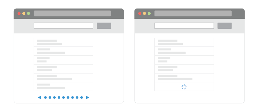
Infinite scroll vs pagination (https://www.smashingmagazine.com/2013/05/infinite-scrolling-lets-get-to-the-bottom-of-this/)
Solution
Due to the time constraints, we kept feedback loops tight by using our internal teams. This included the scrum team and subject matter experts (SMEs). With their feedback I managed to move quickly through problem discovery and rapid prototyping. I opted to not get validation through low fidelity mockups due to the short turnaround time and perceived effort of the task at hand.

Redesigned Financial statements feature
Early mockup

Early mockup
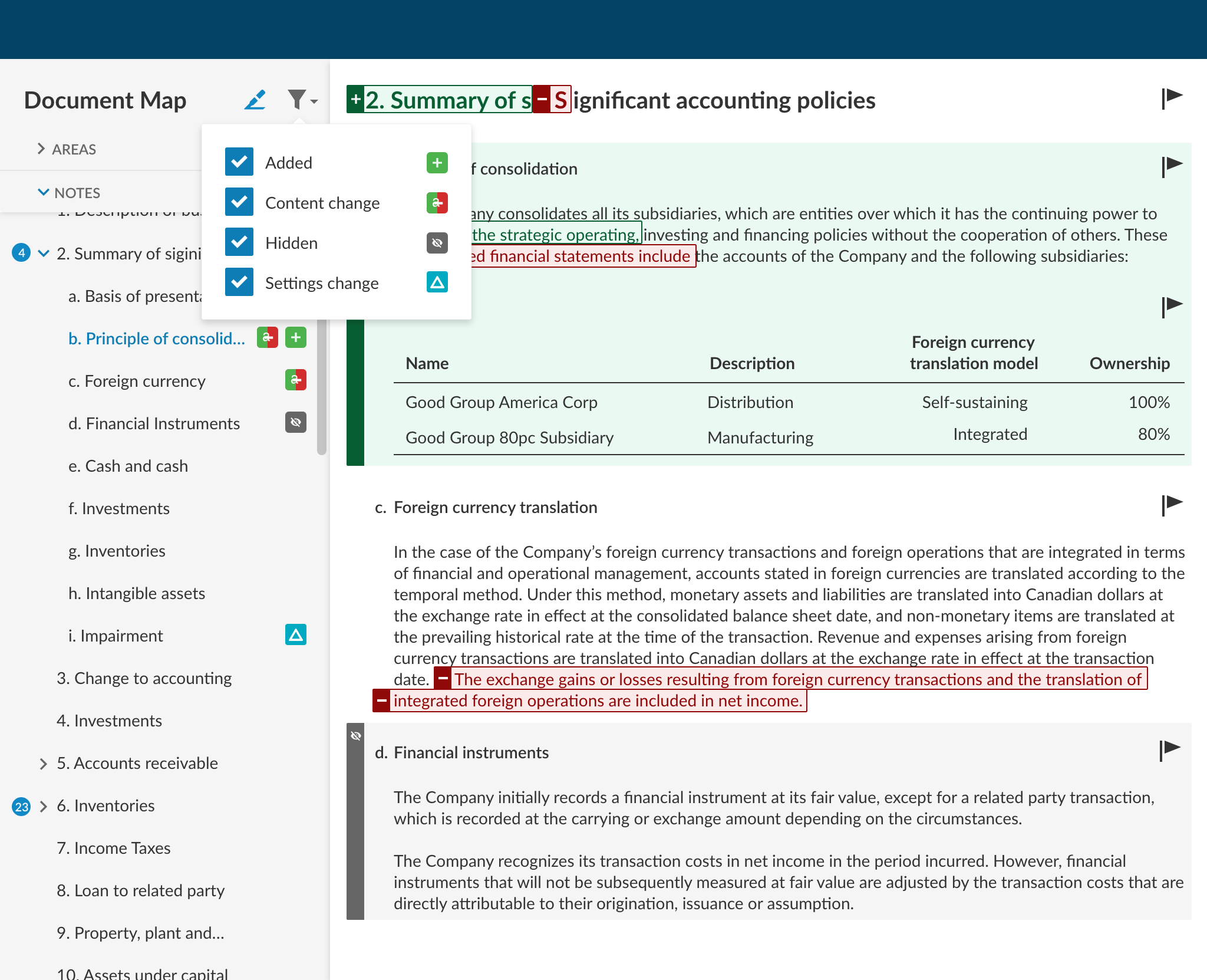
Challenge 1: DIsplaying changes across the document
Each scrollable page only holds a single section of the financial statements, and viewing other sections required navigation. I struggled with the challenge of showing changes from one section while the user was viewing another.
Would the user care about changes in other sections?
Should the type of changes in another section be shown?
Does the amount of changes in another section make a difference when reviewing?
I mocked up solutions for each problem but, as a group, but there were conflicting interpretations of the available data and we could not, as a group, come to a decision. To move forward, I took a step back and noticed that each solution was very similar, differing only in granularity. I made the decision to move forward with displaying only the number of changes in other sections.

Number of changes in another section
Challenge 2: Displaying changes to text with accessibility compliance
“Color is not used as the only visual means of conveying information, indicating an action, prompting a response, or distinguishing a visual element.”
The previous tool used colour as the only indication of certain changes in the document. I wanted something that was easy to read, looked good, and that was still usable for all accounting professionals. I conducted research on products in other fields with similar functionalities (eg. BitBucket and Google Docs) to refine a solution.
Symbols representing change are attached to the affected text along with a coloured underline. Colour is still used, but in a way that is in keeping with the WCAG criteria.

Icons and underlines kept away from the text
Challenge 3: A Discoverable filter layout
The previous tool had filtering available in a panel on the left side, but that panel was repurposed for navigation in the new design. I opted to tuck the filters away in an icon with the prediction that the user would see the new option appear and then seldom use the filters after.
This was going to be a lesson in discoverability, UI and usability best practices

Validating Hypotheses
To assess the new Review Tools, I held remote moderated usability tests with accountants who matched our criteria of reviewing financial statements as a part of their current role. Members of the scrum team were invited to watch the tests and participate in a facilitated insight gathering exercise. I distilled and communicated these insights through a presentation focused on answering the questions that surrounded the design phase.

Mapping feedback from different users
displaying changes across the document
Communicating that there was a change to be reviewed was enough for most users. The amount and type of changes didn’t bear much weight. In some cases, I even noticed confusion surrounding the numbers.
displaying changes to text with accessibility compliance
Users were able to recognize areas that held text changes. Unfortunately there was no recruitment of participants with low vision to truly verify usability in that population, but our test results were positive.
A Discoverable filter layout
It is not a surprise at this point that the filter icon was not very discoverable. Surprisingly, I observed that once the filter was in view, other parts of the tool started to make sense. Users were able to make connections, using the filter as a “legend”, to the rest of the interface.
I designed changes based on the user feedback, which were scheduled for a later release. In the end, the inital two week deadline was met and the door was open for another round of improvement upon the Review Tools.
